ShopDreamUp AI ArtDreamUp
Deviation Actions


Description
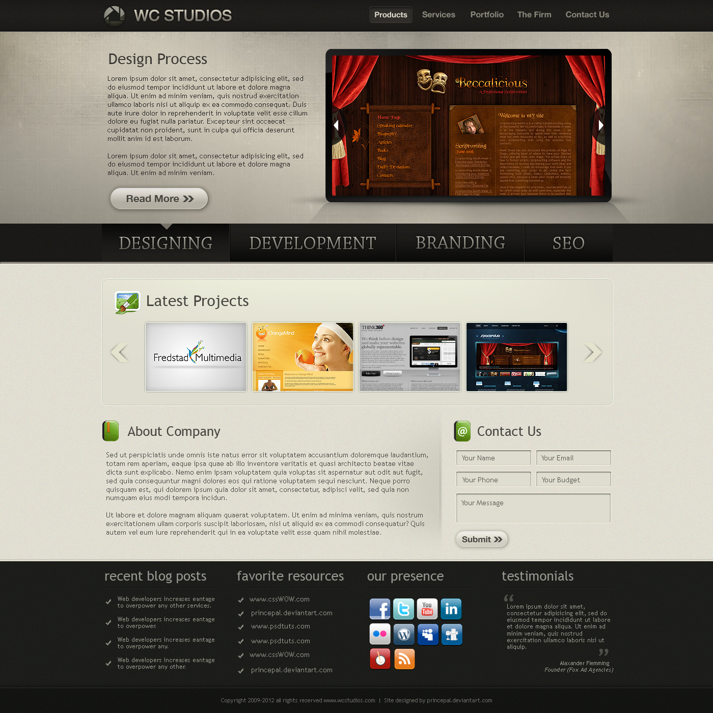
Designed for fun. I did experiment header cum showcase section, i hope you like it or may be not because sometimes our eyes do not accept new things.. LoL
For webdesign email me at palprince@gmail.com
and skype me at princepal-designer
For webdesign email me at palprince@gmail.com
and skype me at princepal-designer
Image size
1400x1400px 1.75 MB
Comments95
Join the community to add your comment. Already a deviant? Log In
First thing that rubbed me the wrong way is that I feel like there are too many focal points. My eyes were immediately split between the design process section, the huge middle navigation and the lower latest projects section. I completely missed the upper navigation and logo. It is very confusing. I almost feel like things were just haphazardly placed on the page.
Understand that you don't necessarily have to remove a lot of this but I think more time should be spent on user experience and user interface elements of this page; making it so people flow from one section to the next. There is a lot of information on this page to digest and maybe incorporating more white space could possibly help that out. The only way I think this would possibly be acceptable is if that middle navigation started at the top and dropped down after a click using AJAX functionality. Even still though I think the contact form should be moved down to the footer or removed completely. First time viewers are going to be looking for information and won't have any need to contact you until they're content with what they've discovered after looking over the site.
Also normally I wouldn't bring this up but since you have SEO on the page I thought I'd make mention of it. In the design process section you have a button that says read more. Now there is nothing wrong with having that, thousands of websites use a 'read more' button all the time. Though in terms of SEO you'd gain a lot more by putting unique text to help give that link a better definition of what it is and what it's linking to. If you think about it what if you had 20 of those read more links? You'd have to go through and give them a unique title(I think it's title) to have it validate since each link reads the same but links to different pages. Just another opportunity to place your desired keywords to hopefully dominate the SERPS.
Last but not least I looove the little green icons. My only hangup on that is I wish you would have brought a little more of that into the design. Not exactly sure what you'd want to incorporate but I bet it would add depth and a fun aesthetic to the website. It would help give the webstie a little more life too.